Peşakar, təcrübəli mühəndislər və işçi heyəti tərəfindən sifarişçi şirkətin bütün tələblərinə əməl olunur.
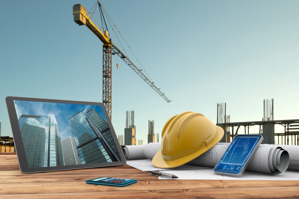
Memarlıq
Bütün memarlıq işlərimiz Azərbaycan və Avropa incəsənətini nəzərə alaraq həyata keçirilir.
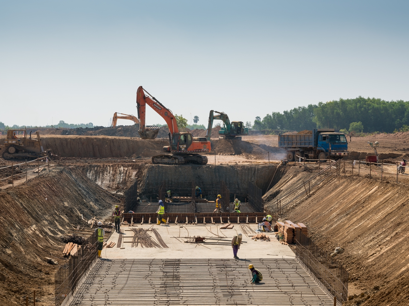
Qazıntı
Qazıntı işləri bütün standartlar çərçivəsində formalaşır və tətbiq olunur.
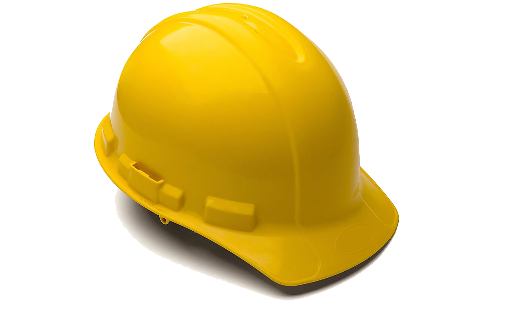
Dəmir Beton Konstruksiya
El-Seym inşaat Dəmir Beton Konstruksiya işlərini bütün təhlükəsizlik, istismara yararlılıq, uzunömürlülük və həmçinin layihələndirmə tapşırığında göstərilən əlavə tələbləri təmin edir.
“EL-SEYM İNŞAAT” QSC 1996-ci ildən hal-hazıra kimi Azərbaycanda fəaliyyət göstərən bir çox xarici və yerli şirkətlərin sifarişi əsasında Baş Podratçı funksiyasını öz üzərinə götürərək çoxlu sayda inzibati, yaşayış, təmir-tikinti, mühəndis kommunikasiya və sair işləri yüksək keyfiyyətlə yerinə yetirmişdir.
El-Seym İnşaat şirkəti texniki mükəmməllik və innovativ həllər ilə layihələr həyata keçirir.
Layihələndirmə
Layihələndirmə tikinti icrasının ilkin mərhələsidir və bütün incəliklər, sərfəli və keyfiyyətli təkliflər müştəriyə təklif olunur
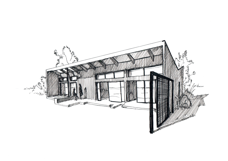
Dizayn
Eksteryer və İnteryer dizayn işləri müştərilərin zövqləri əsasında həyata keçirilir
Konstruksiya
Tam müasir və peşəkar kollektiv tərəfindən yüksək keyfiyyət və təhlükəsiz inşaat işləri həyata keçirilir
QÜRURLA DEYƏ BİLƏRİK Kİ,
EL-SEYM İNŞAAT ÖZ İŞİNİ SEVGİ İLƏ GÖRÜR BUNA BÜTÜN MÜŞTƏRİLƏRİMİZ ŞAHİDDİR
1996-cı ildə fəaliyyətə başlayan “EL-SEYM İNŞAAT” QSC yaşayış və qeyri yaşayış binalarının beynəlxalq standartlara uyğun tikintisi sahəsində ixtisaslaşan aparıcı şirkətdir və bir sıra əsas məkanlarda həm mükəmməl arxitektura, həm də tikinti-inşaat işlərinin keyfiyyəti baxımından möhtəşəm layihələrə imza atmışdır.
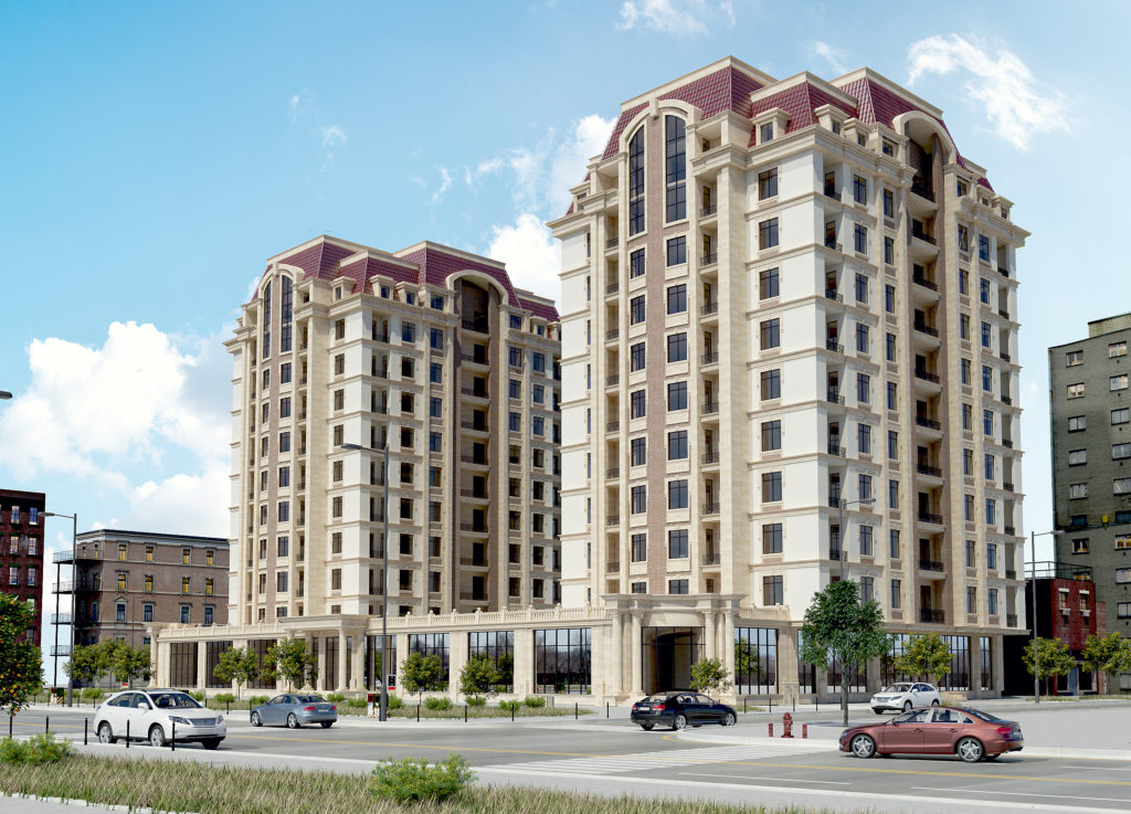
2017-ci ildə “Çinar-2016” Mənzil-Tikinti Kooperativi :
– Sumqayıt şəhəri yeni bulvar ərazisində 2 bloklu, 10 mərtəbəli yaşayış binasının tikinti işləri görülmüşdür
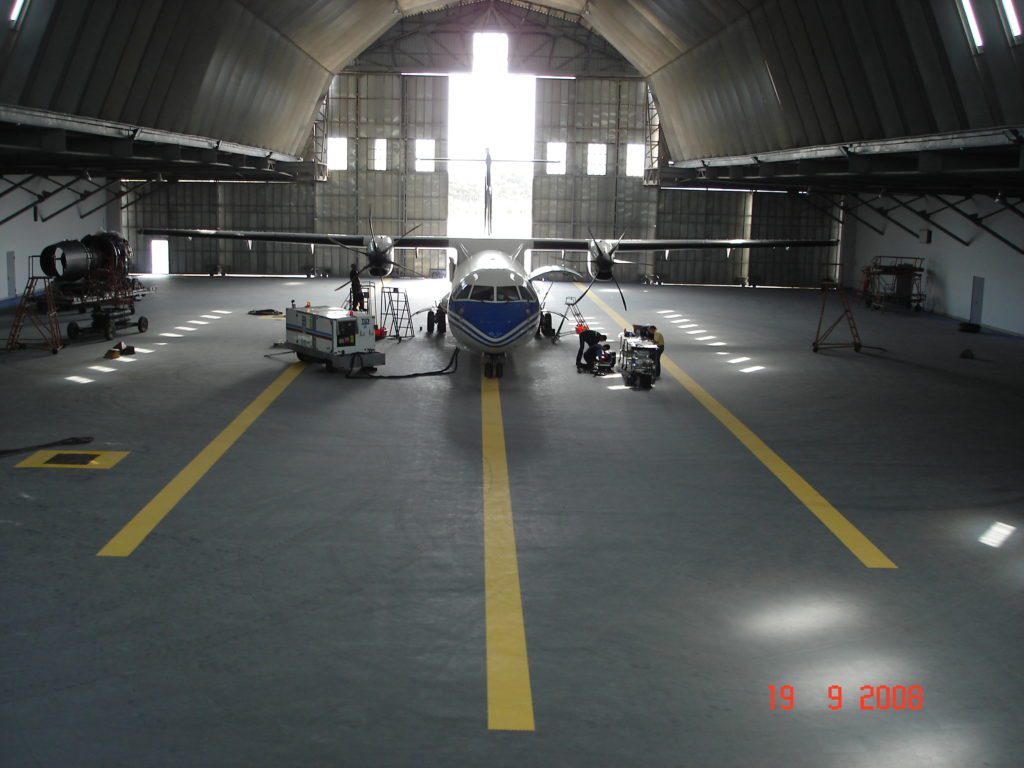
Bakı
Təyyarə ANQARI
“EL-SEYM İNŞAAT” QSC 2000-2003-cü illərdə Bakı şəhərinin Binə Hava Limanında Azərbaycan Hava Yolları Dövlət Konserninin Azərbaycan-İrlandiya-“AZAL” ATM Müştərək Müəssisəsinin sifarişi əsasında “Boeinq-757” və “2006-2008-ci illərdə “Silk Way Technics” MMC- nin sifarişi əsasında “Golfstream” təyyarələri üçün iri aşırımlı müasir anqar komplekslərinin tikinti-quraşdırma işlərini yüksək keyfiyyətlə yerinə yetirərək istismara təhvil vermişdir.
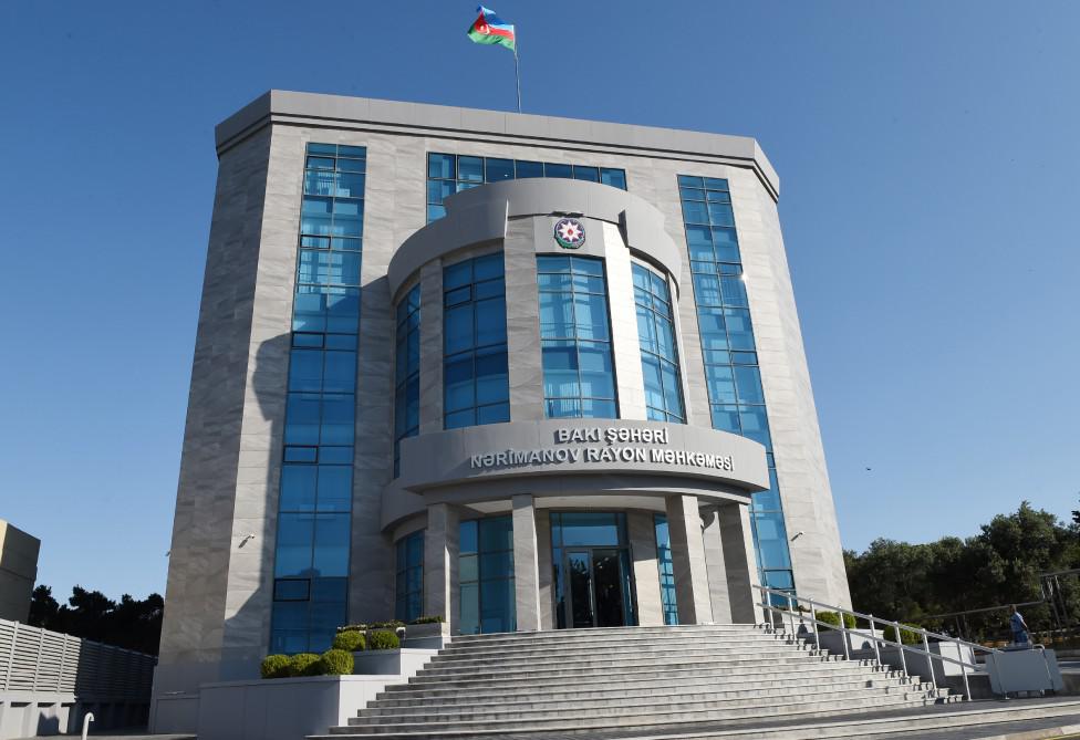
BAKI
NƏRİMANOV RAYON MƏHKƏMƏSİ
2017-ci ildə Dünya Bankının maliyyə dəstəyi ilə Azərbaycan Respublikası Ədliyyə Nazirliyi/“Mütərəqqi Ədliyyə Xidmətləri və Müasir Məhkəmə İnfrastrukturu” layihəsinin sifarişi əsasında Bakı şəhəri, Nərimanov Rayon Məhkəməsinin 6 mərtəbəli yeni inzibati binanın tikinti işlərini başa çatdırmışdır. Obyektin açılışında Azərbaycan Respublikasının prezidenti cənab İlham Əliyev iştirak etmişdir.
BAKI
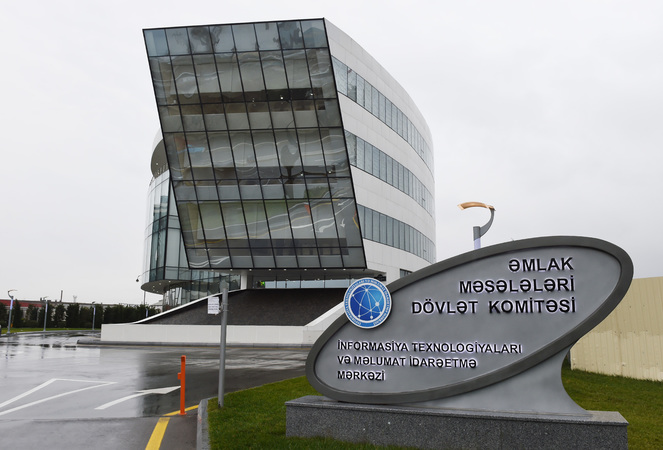
İNFORMASİYA TEXNOLOGİYALARI MƏRKƏZİ
2014 – 2015 – ci illərdə Dünya Bankının maliyyə dəstəyi ilə Əmlak Məsələləri dövlət Komitəsinin yanında Daşınmaz Əmlakın Dövlət Reyster Xidməti/Daşınmaz Əmlakın Qeydiyyatı Layihəsi ƏMDK-nin İnformasiya Texnologiya Mərkəzinin 4 mərtəbəli yeni inzibati binasının tikintisini başa çatdırmışdır. Obyektin açılışında Azərbaycan Respublikasının prezidenti cənab İlham Əliyev iştirak etmişdir.
"EL-SEYM İNŞAAT"-a Xoş Gəlmisiniz!
Devizimiz – Peşəkarlıq, innovativlik və məsuliyyətdir!
Peşakar, təcrübəli mühəndislər və işçi heyəti tərəfindən sifarişçi şirkətin bütün tələblərinə əməl olunur.
Memarlıq
Bütün memarlıq işlərimiz Azərbaycan və Avropa incəsənətini nəzərə alaraq həyata keçirilir.
Qazıntı
Qazıntı işləri bütün standartlar çərçivəsində formalaşır və tətbiq olunur.
Dəmir Beton Konstruksiya
El-Seym inşaat Dəmir Beton Konstruksiya işlərini bütün təhlükəsizlik, istismara yararlılıq, uzunömürlülük və həmçinin layihələndirmə tapşırığında göstərilən əlavə tələbləri təmin edir.
“EL-SEYM İNŞAAT” QSC 1996-ci ildən hal-hazıra kimi Azərbaycanda fəaliyyət göstərən bir çox xarici və yerli şirkətlərin sifarişi əsasında Baş Podratçı funksiyasını öz üzərinə götürərək çoxlu sayda inzibati, yaşayış, təmir-tikinti, mühəndis kommunikasiya və sair işləri yüksək keyfiyyətlə yerinə yetirmişdir.
El-Seym İnşaat şirkəti texniki mükəmməllik və innovativ həllər ilə layihələr həyata keçirir
Layihələndirmə
Layihələndirmə tikinti icrasının ilkin mərhələsidir və bütün incəliklər, sərfəli və keyfiyyətli təkliflər müştəriyə təklif olunur
Dizayn
Eksteryer və İnteryer dizayn işləri müştərilərin zövqləri əsasında həyata keçirilir
Konstruksiya
Tam müasir və peşəkar kollektiv tərəfindən yüksək keyfiyyət və təhlükəsiz inşaat işləri həyata keçirilir
QÜRURLA DEYƏ BİLƏRİK Kİ
EL-SEYM İNŞAAT ÖZ İŞİNİ SEVGİ İLƏ GÖRÜR BUNA BÜTÜN MÜŞTƏRİLƏRİMİZ ŞAHİDDİR
1996-cı ildə fəaliyyətə başlayan “EL-SEYM İNŞAAT” QSC yaşayış və qeyri yaşayış binalarının beynəlxalq standartlara uyğun tikintisi sahəsində ixtisaslaşan aparıcı şirkətdir və bir sıra əsas məkanlarda həm mükəmməl arxitektura, həm də tikinti-inşaat işlərinin keyfiyyəti baxımından möhtəşəm layihələrə imza atmışdır
2017-ci ildə “Çinar-2016” Mənzil-Tikinti Kooperativi :
– Sumqayıt şəhəri yeni bulvar ərazisində 2 bloklu, 10 mərtəbəli yaşayış binasının tikinti işləri görülmüşdür
Bakı
Təyyarə ANQARI
“EL-SEYM İNŞAAT” QSC 2000-2003-cü illərdə Bakı şəhərinin Binə Hava Limanında Azərbaycan Hava Yolları Dövlət Konserninin Azərbaycan-İrlandiya-“AZAL” ATM Müştərək Müəssisəsinin sifarişi əsasında “Boeinq-757” və “2006-2008-ci illərdə “Silk Way Technics” MMC- nin sifarişi əsasında “Golfstream” təyyarələri üçün iri aşırımlı müasir anqar komplekslərinin tikinti-quraşdırma işlərini yüksək keyfiyyətlə yerinə yetirərək istismara təhvil vermişdir.
BAKI
NƏRİMANOV RAYON MƏHKƏMƏSİ
2017-ci ildə Dünya Bankının maliyyə dəstəyi ilə Azərbaycan Respublikası Ədliyyə Nazirliyi/“Mütərəqqi Ədliyyə Xidmətləri və Müasir Məhkəmə İnfrastrukturu” layihəsinin sifarişi əsasında Bakı şəhəri, Nərimanov Rayon Məhkəməsinin 6 mərtəbəli yeni inzibati binanın tikinti işlərini başa çatdırmışdır. Obyektin açılışında Azərbaycan Respublikasının prezidenti cənab İlham Əliyev iştirak etmişdir.
BAKI
İNFORMASİYA TEXNOLOGİYALARI MƏRKƏZİ
2014 – 2015 – ci illərdə Dünya Bankının maliyyə dəstəyi ilə Əmlak Məsələləri dövlət Komitəsinin yanında Daşınmaz Əmlakın Dövlət Reyster Xidməti/Daşınmaz Əmlakın Qeydiyyatı Layihəsi ƏMDK-nin İnformasiya Texnologiya Mərkəzinin 4 mərtəbəli yeni inzibati binasının tikintisini başa çatdırmışdır. Obyektin açılışında Azərbaycan Respublikasının prezidenti cənab İlham Əliyev iştirak etmişdir.


 Azərbaycan dili
  English
  Русский